Case File 009 — Research & Web Design
Beneath the Surface: Newtown Creek
A research-driven website examining the hidden environmental conditions of Newtown Creek through photography, data visualization, fieldwork, and an interview with the U.S. Environmental Protection Agency.
01 — Overview
About the project
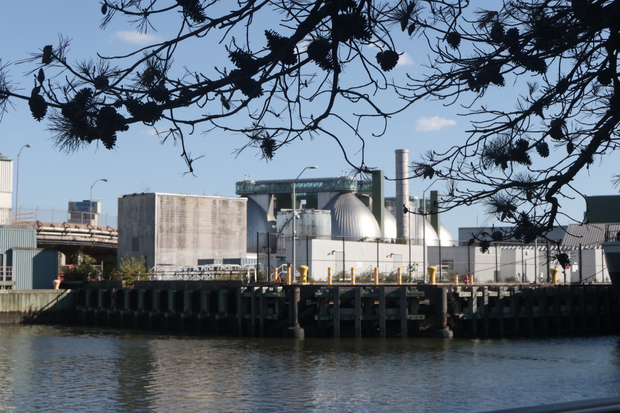
At first glance, Newtown Creek can appear unexpectedly peaceful. The water reflects the sky, plants grow along portions of the shoreline, and from certain angles the landscape can look almost picturesque.
Beneath that surface is a waterway shaped by decades of industrial contamination, sewage overflow, and environmental neglect.
Created over the course of one semester, Beneath the Surface is a research-driven website investigating the contrast between the creek's visible appearance and the systems operating around and below it. The project combines historical and environmental research, original photography, interactive data visualizations, and an interview with a coordinator working on the creek's federal cleanup process.
I created the project to help people living near Newtown Creek, as well as those who may know nothing about it, better understand the severity of its pollution, the communities affected by it, and the institutional challenges surrounding its cleanup.
02 — The Proposal
Beginning with precarity
The course asked us to identify a specific social, political, or cultural issue affecting a historically or structurally marginalized community.
My proposal needed to define the issue, the community experiencing harm, a specific case study, the systems contributing to that harm, and the people or organizations working toward change.
I chose Newtown Creek because it connected my interest in environmental issues with a place where the effects of industrial activity remain present. I was particularly drawn to the contradiction between what the creek looked like and what existed underneath it.
The project began with a question:
How can digital media make environmental harm visible when that harm is not always immediately apparent?
03 — Research
Researching the creek
My research examined the history and current conditions of pollution in Newtown Creek, its effects on nearby communities, existing cleanup efforts, and the organizations involved in addressing the problem.
I reviewed reports, public resources, and data from sources including the New York State Department of Health, the Newtown Creek Alliance, the New York City Department of Environmental Protection, the U.S. Environmental Protection Agency, and other environmental research organizations.
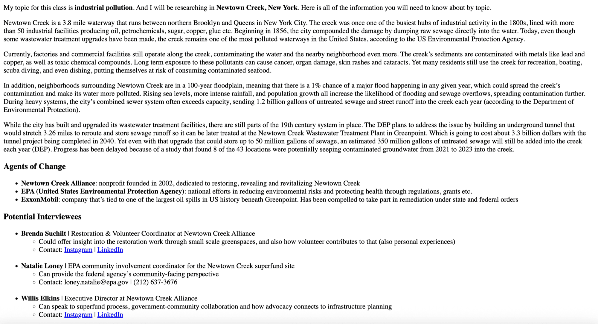
I also researched potential interviewees who could offer perspectives beyond what was available through published reports.
The resulting website was organized into sections for background research, photography, data, the interview, and public resources. Although each section presented a different type of material, they all returned to the same contrast between visibility and concealment.
04 — Photography
Seeing the landscape in person
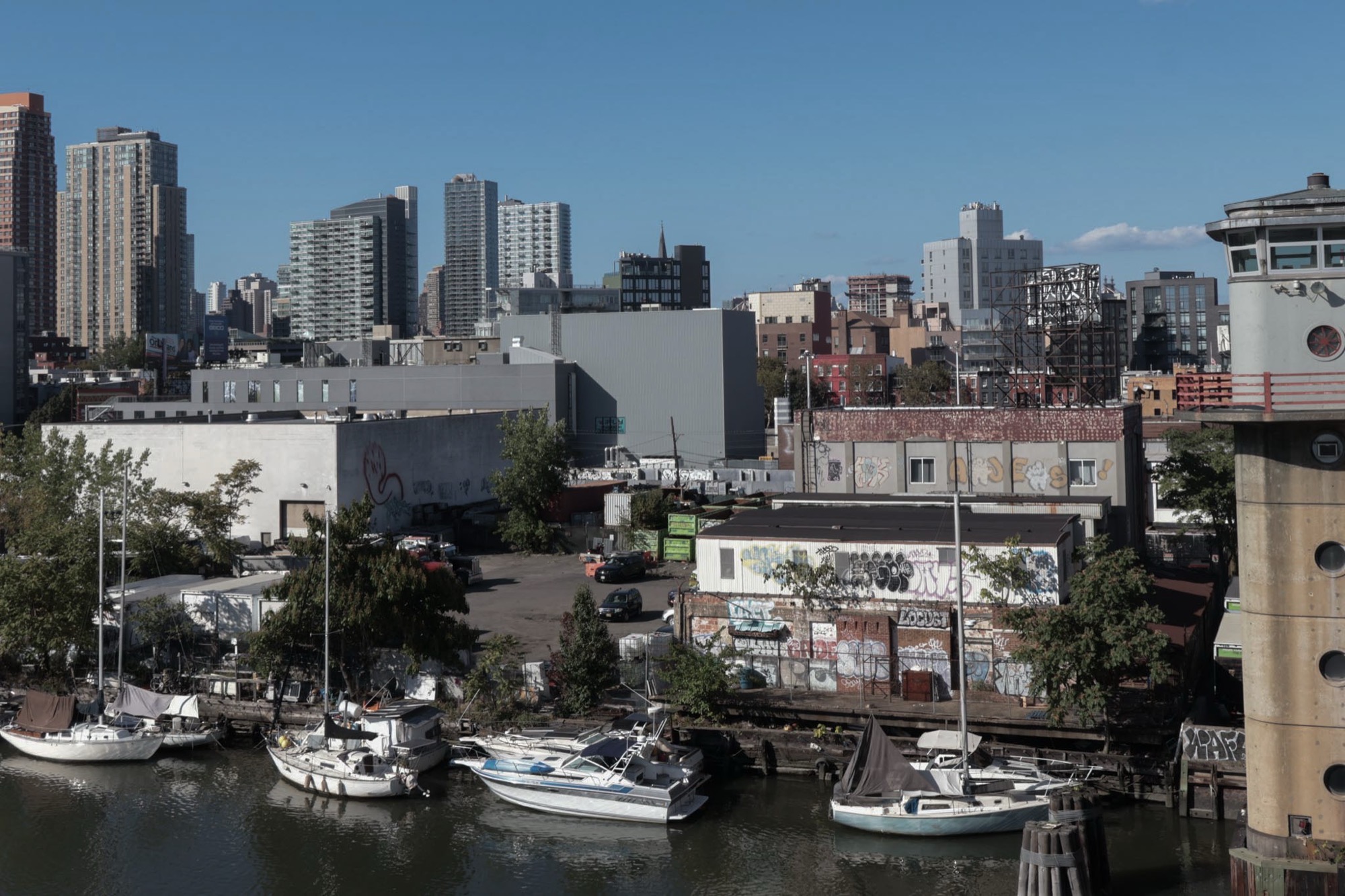
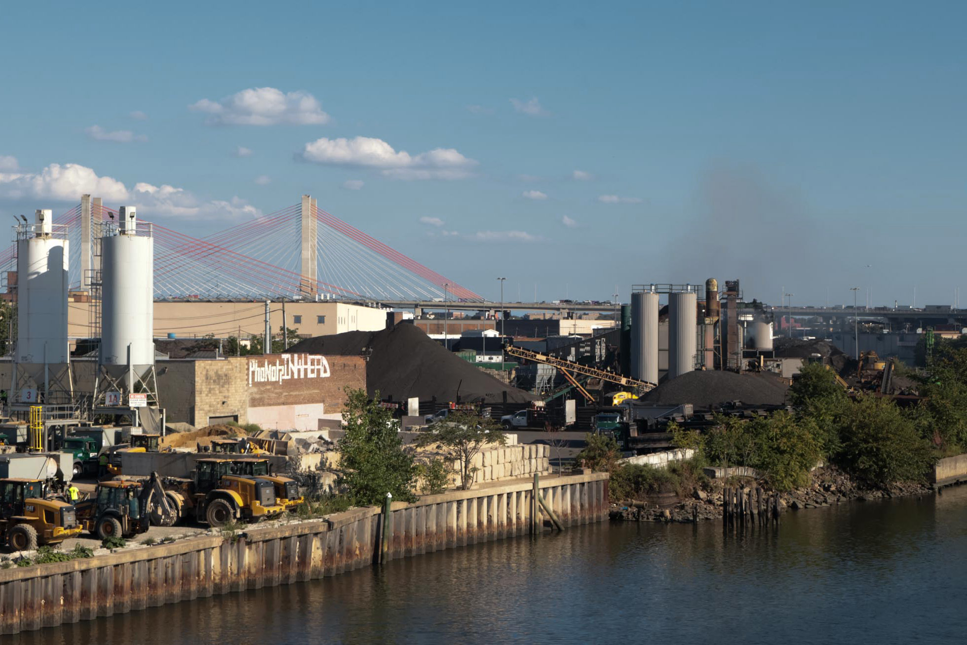
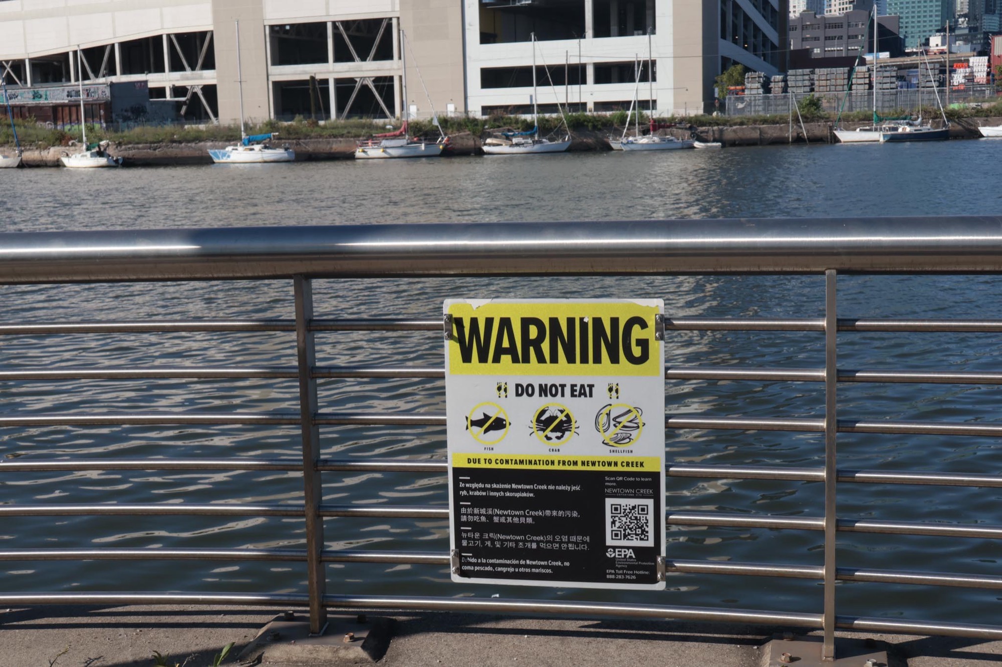
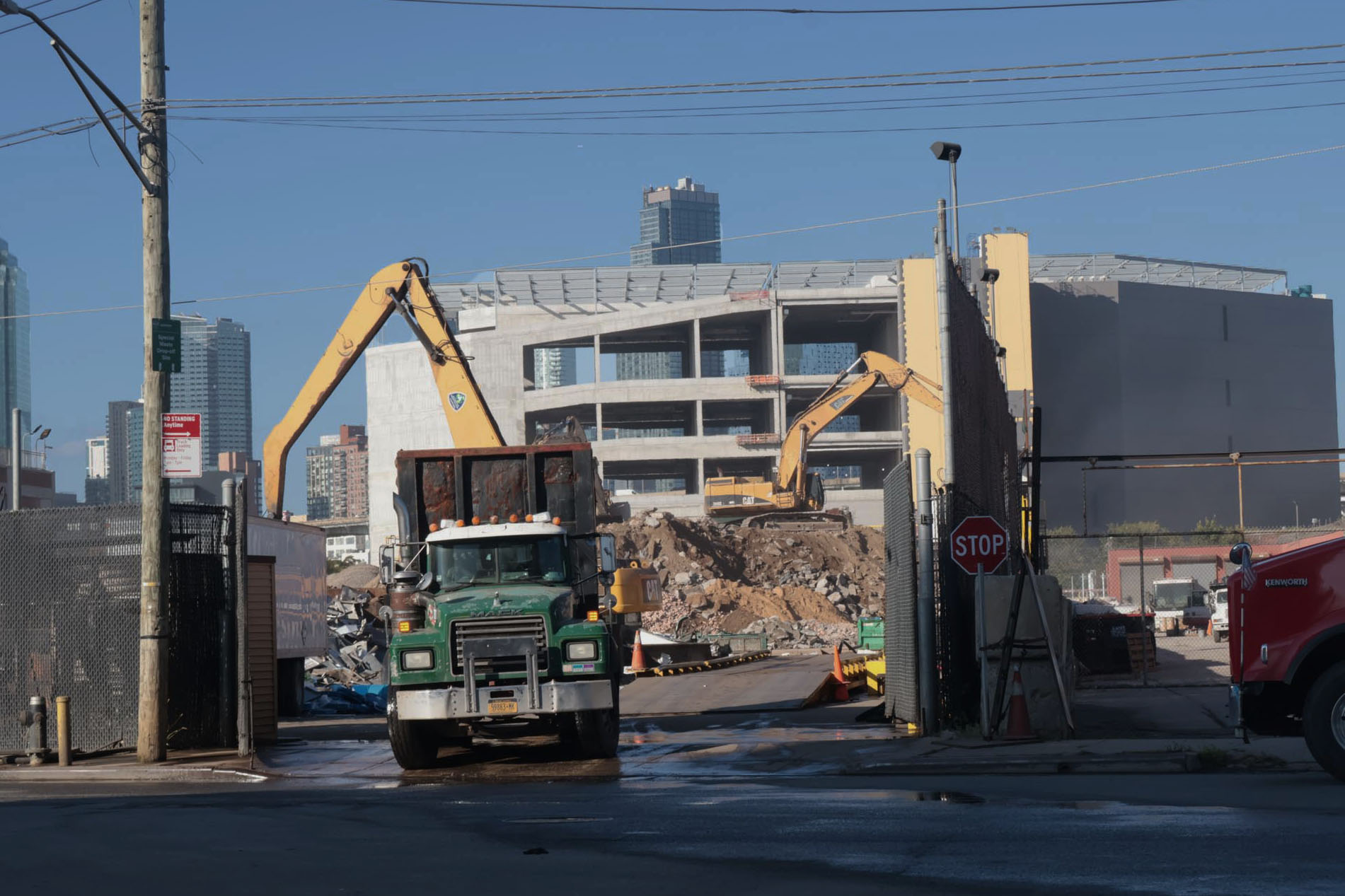
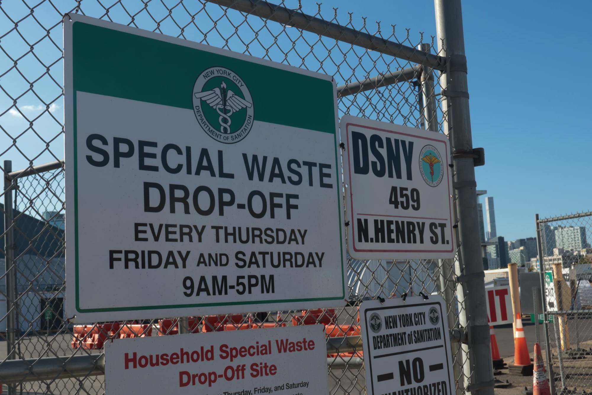
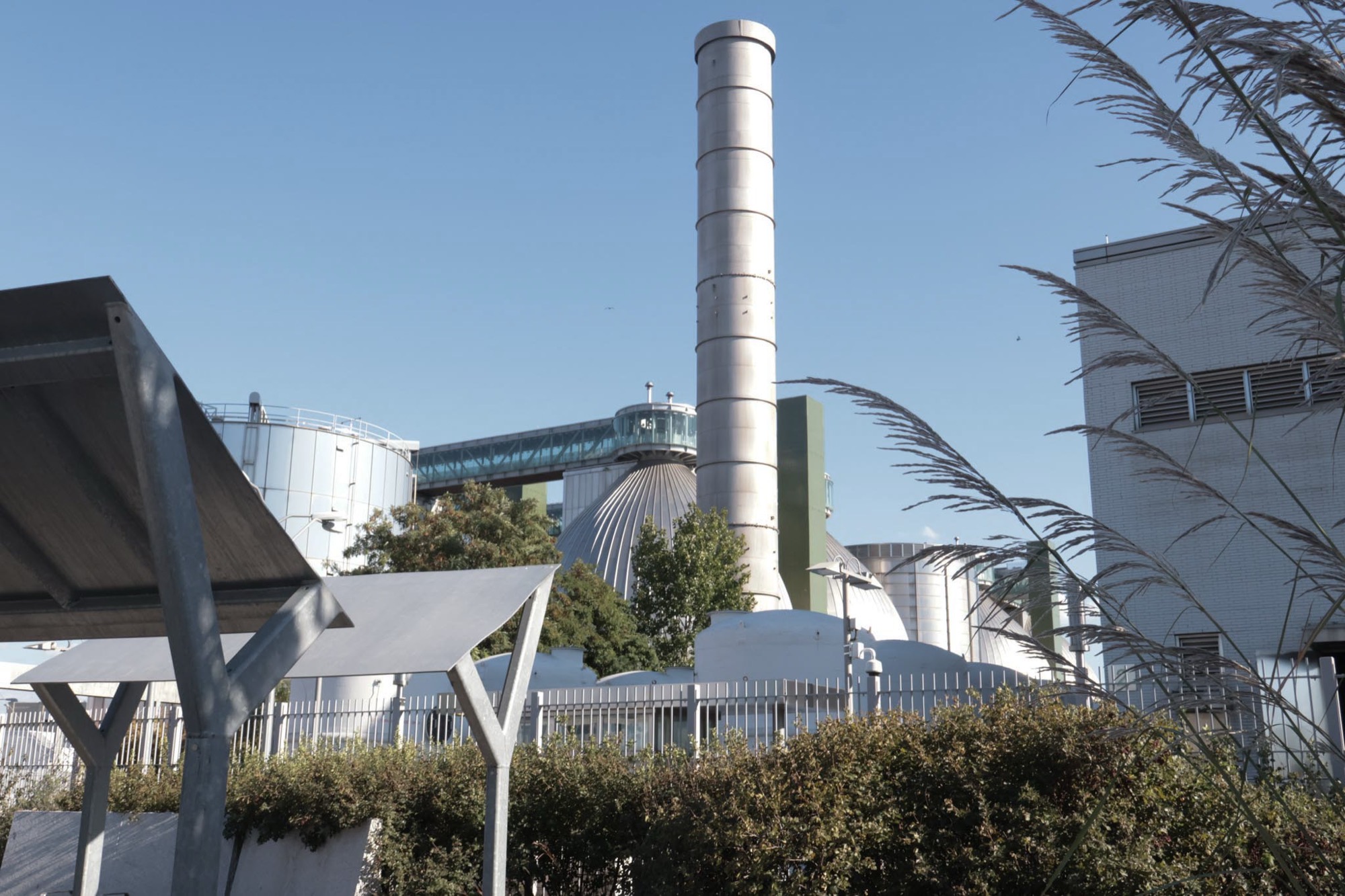
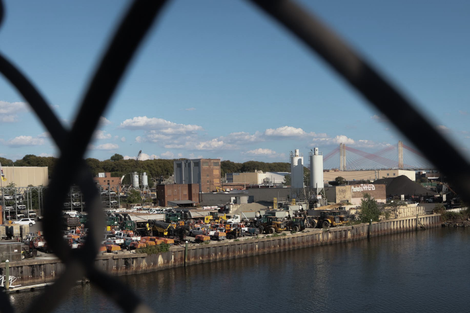
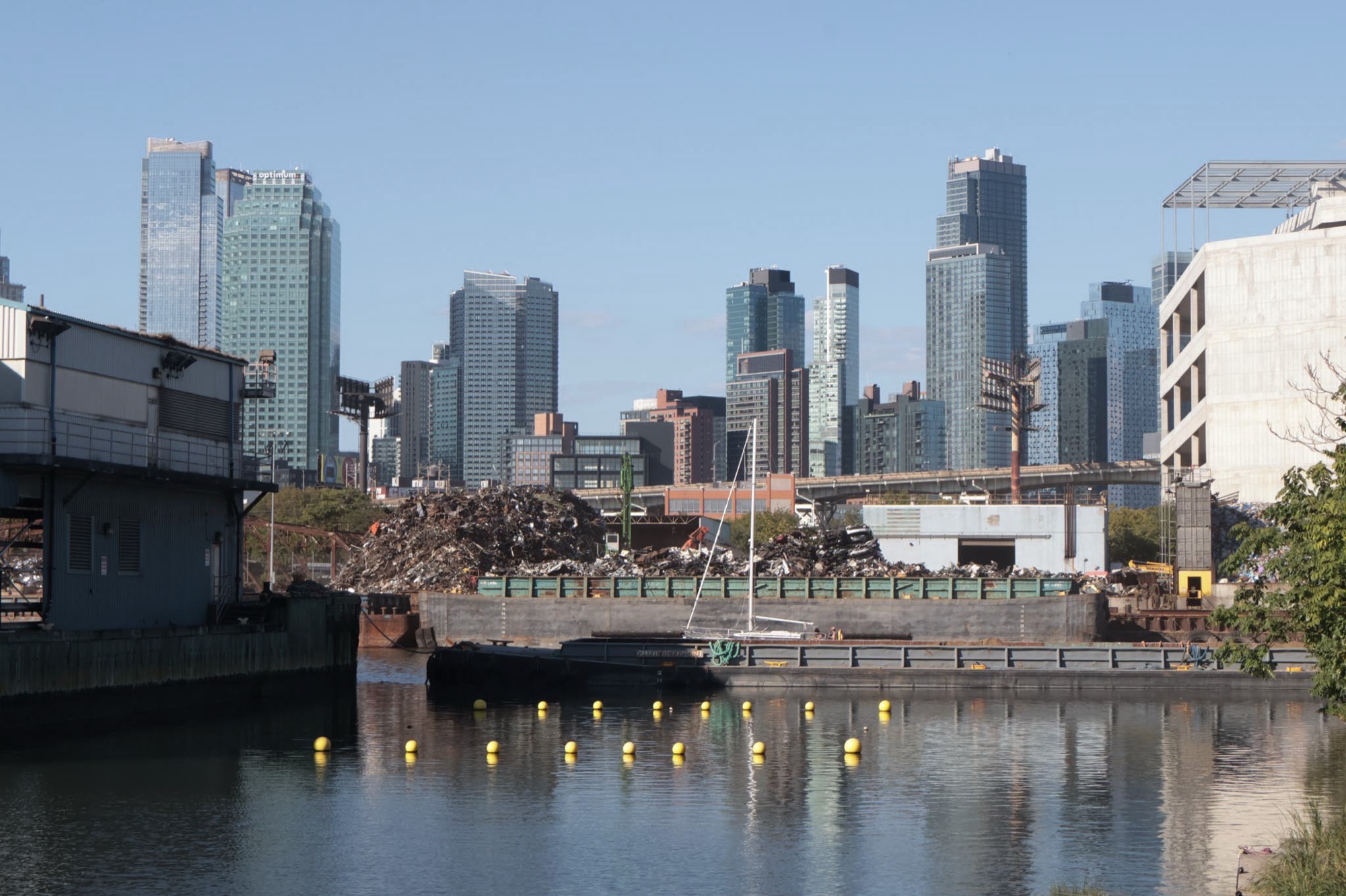
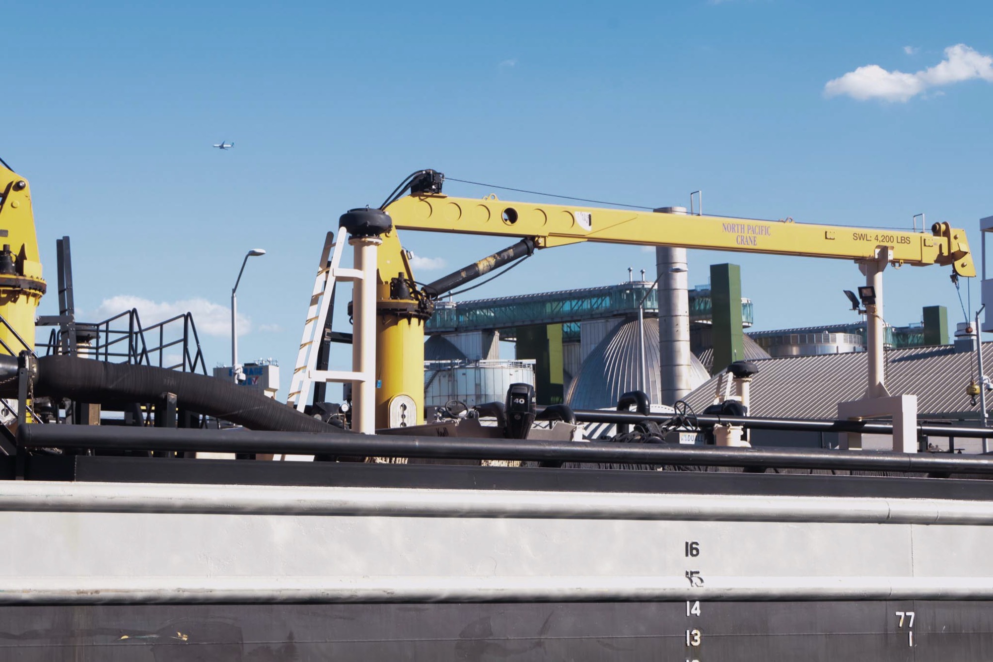
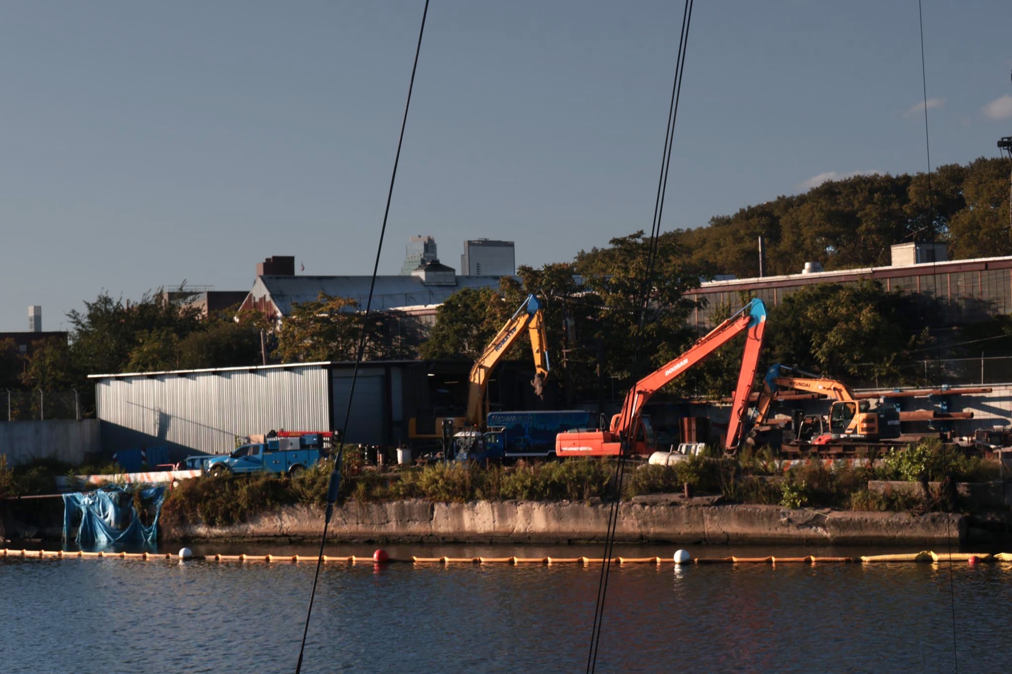
I visited Newtown Creek and walked along an extended portion of the waterway, photographing the creek and its surrounding industrial landscape.
The photographs became an important part of the project because they captured the same tension that initially drew me to the subject. Many of the images looked visually appealing despite documenting an area affected by serious pollution.
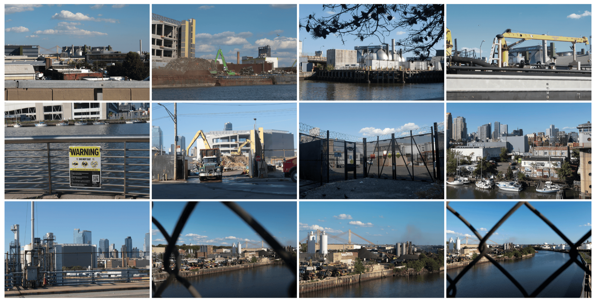
The photographs looked "too good" to represent industrial contamination.
That observation, raised during critique, eventually reinforced the project's title. The beauty of the photographs was not necessarily inaccurate; it was part of the problem. A visually calm surface could obscure the environmental conditions underneath it.
In some images, I reduced the saturation of the blue water and increased the visibility of nearby garbage, smoke, or industrial structures. These adjustments were intended to redirect attention toward details that could otherwise disappear inside the landscape.
Scroll to see more →
05 — Interview
Looking from the administrative side
To better understand the cleanup process, I interviewed Natalie Loney, a Community Involvement Coordinator for the U.S. Environmental Protection Agency's Region 2 Superfund program.
Her role connects the agency with the communities affected by Superfund sites. Through our conversation, I learned about her daily work, the stages of the cleanup process, the agency's community engagement responsibilities, and the institutional constraints that can delay environmental action.
The interview complicated the narrative I had encountered through research alone. It was easy to describe the cleanup as simply moving too slowly, but the conversation revealed the regulatory, logistical, financial, and communication challenges operating behind that delay.
This perspective became another meaning of "beneath the surface." The project was not only about pollution hidden beneath the water, but also about the administrative systems and limitations that are often invisible to the public.
06 — Data
Translating evidence into data
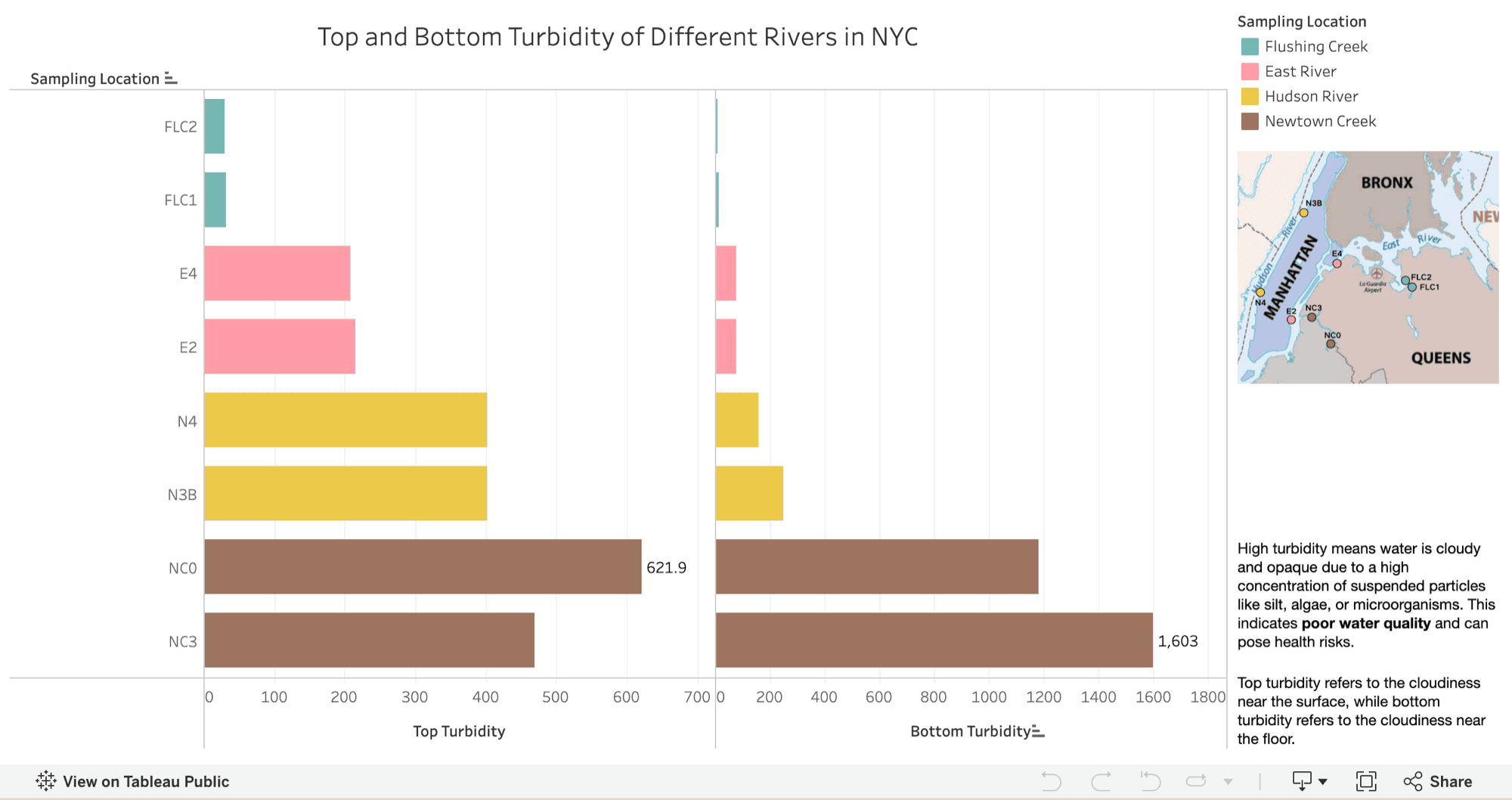
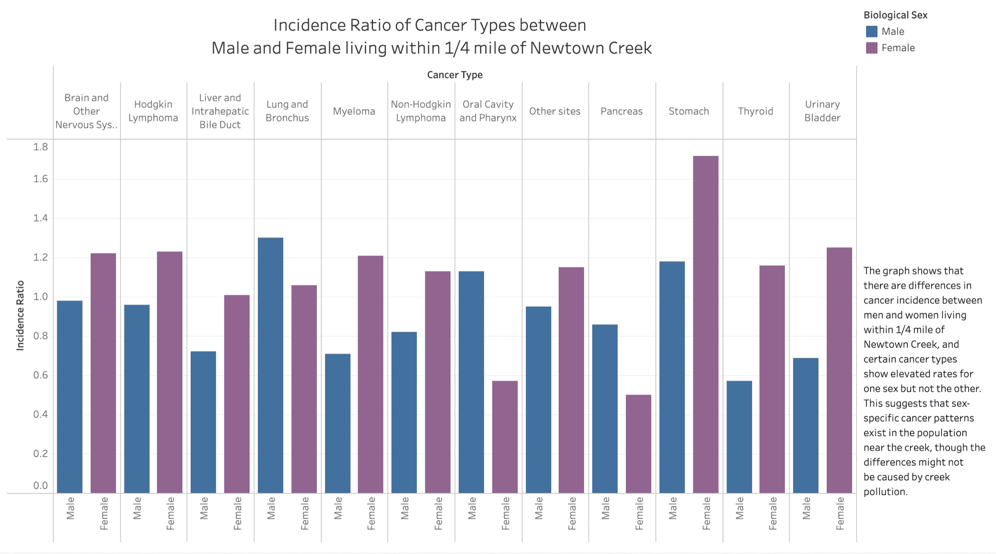
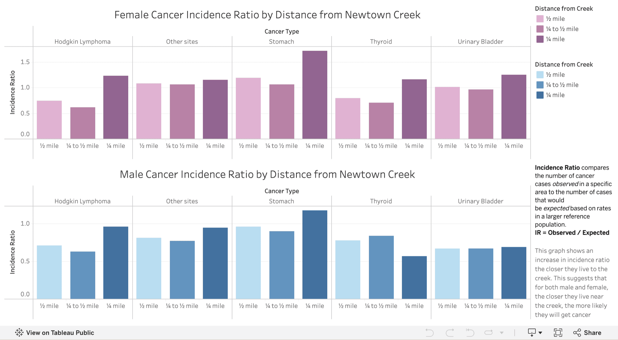
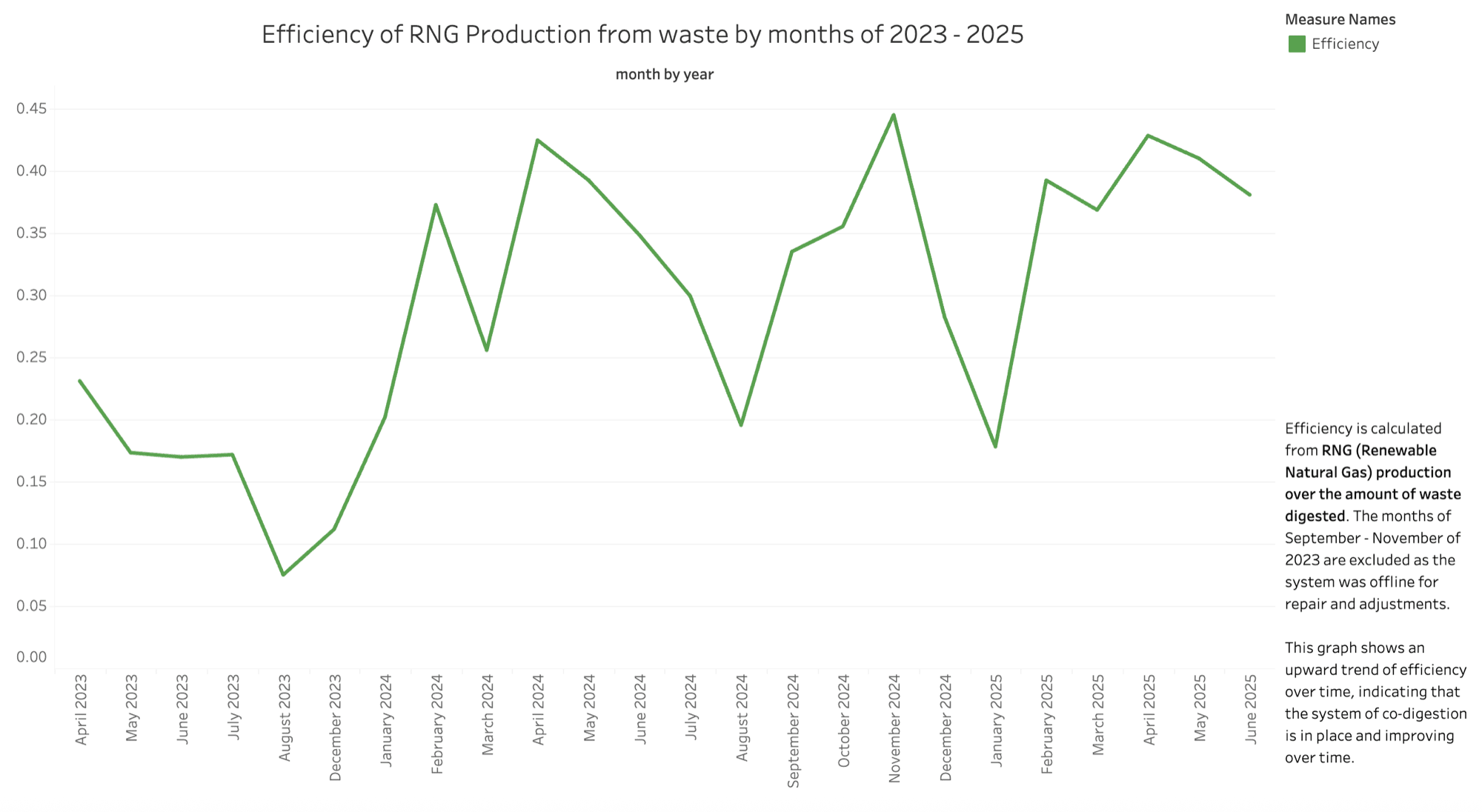
I used Tableau to develop a series of visualizations that allowed visitors to compare environmental and health-related patterns more directly. The visualizations included:
- A comparison of top and bottom turbidity measurements across New York City waterways, including Newtown Creek, the East River, and the Hudson River
- Cancer-incidence ratios for men and women living within a quarter mile of Newtown Creek
- A line graph examining the monthly efficiency of renewable natural gas production from waste between 2023 and 2025
- Maps connecting the research to specific locations
I selected information that could reveal a clear trend, relationship, or comparison when presented visually. Interactive tooltips allowed visitors to inspect individual values without placing every detail directly on the page.
Developing the data section required extensive experimentation. I tested different chart types, revised how values were presented, and worked through the process of connecting and organizing multiple tables in Tableau. Regular class critiques also helped me reconsider which visual forms communicated the data most clearly.
Scroll to see more →
07 — Design
Designing the website
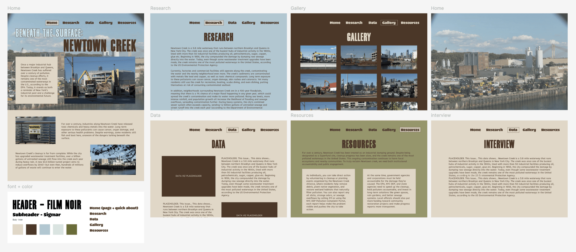
Before coding, I created a Figma prototype to establish the site's structure, typography, colors, and content hierarchy.
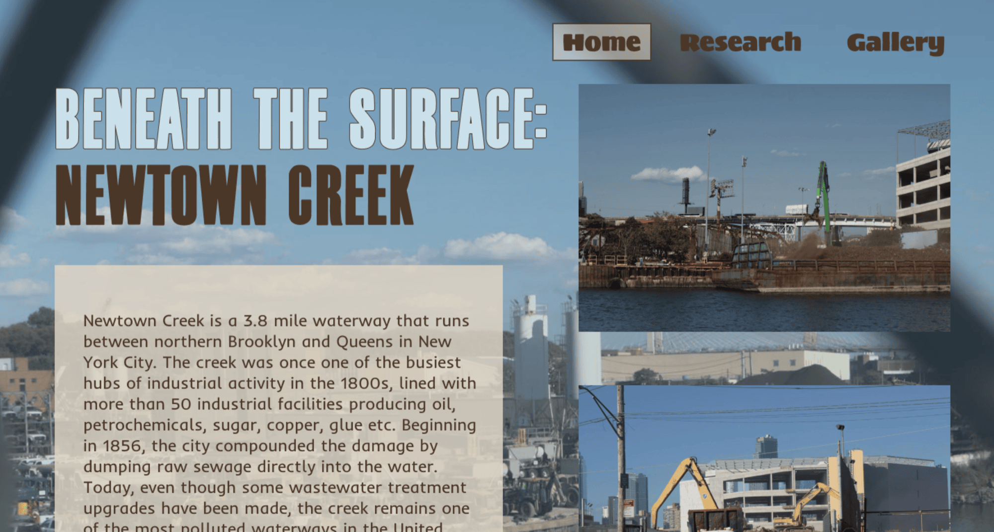
The website was built from scratch primarily using HTML and CSS, with jQuery used for gallery features and Tableau used for the interactive visualizations.
Because the project needed to present substantial research clearly, I initially prioritized legibility and organization. I used simple backgrounds, text containers, photographs, and data embeds rather than more experimental interactions.
08 — Intervention
Moving from documentation toward intervention
As the project developed, I began to see that Newtown Creek's pollution was not the only thing hidden from view. The cleanup process itself was also difficult for the public to follow.
My interview with EPA Community Involvement Coordinator Natalie Loney helped me understand why progress has been so slow. Before a final remedy can be selected, the agency must complete an extensive modeling and remedial-design process. Because the site is unusually complex, that work has taken years and cannot be rushed without affecting the accuracy of the eventual cleanup plan.
However, this creates a gap between scientific progress and visible progress. Technical work may be taking place, but nearby communities often cannot see what has changed, what questions remain, or what will happen next.
My research also revealed a second gap: while the long-term cleanup is being designed, there is little visible ecological action taking place in the creek.
For the final phase of the project, I developed Making Cleanup Visible: Quarterly Updates & Ecological Pilot Program, a proposal framed for EPA Region 2 and the New York State Environmental Facilities Corporation. It combines a public-communication strategy with small-scale ecological interventions that could take place without disrupting the future Superfund remedy.
09 — Reflection
Looking back
The project made me reconsider the relationship between clarity and creativity in informational web design. I focused so strongly on making the research understandable that I left less room to experiment with the site's central metaphor.
Because the course was project-based, each part of the project went through multiple drafts before reaching its final form. Looking back, that repeated critique made a real difference: it reshaped how I visualized the data, sharpened the research, and pushed the design toward something clearer than where it started.
With more time, I would create interactions that allow visitors to uncover information beneath visual layers, move between the visible water and the conditions below it, or gradually reveal data through scrolling. I would also improve the mobile experience, where parts of the navigation and embedded visualizations currently exceed the screen.
I would also expand the interview component. I contacted community and research organizations during the project but was not able to speak with everyone I approached. My interview with the EPA showed how much a direct conversation can reveal beyond published material. Additional perspectives from advocacy groups, researchers, and residents would make the project more complex and more representative of the people connected to the creek.
Beneath the Surface ultimately taught me that environmental storytelling must do more than present accurate information. It must help people see relationships — between appearance and reality, data and lived experience, institutional systems and local communities, and research and possible action.