Case File 001 — Visual Identity
mediaWorks_2026
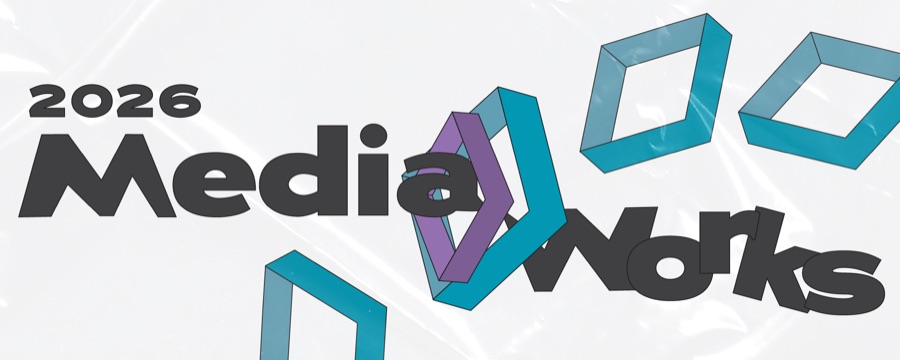
A flexible visual identity developed for NYU MCC MediaLab's annual showcase of student digital media work.
01 — Overview
About the project
MediaWorks is an annual showcase bringing together digital media projects created by NYU undergraduate and graduate students. The event invites students, faculty, staff, alumni, and other visitors to explore work produced across different courses, disciplines, and forms of media.
Because MediaWorks receives a new visual identity each year, the 2026 event needed a system that could feel distinct while remaining flexible enough to work across posters, social media, email, printed programs, signage, animation, and physical objects.
As Lead Visual Designer, I independently developed the central identity before working with the wider MediaLab team to adapt it across the event. What began as a logo and visual direction eventually grew into a shared system used by approximately five other team members to create additional signage, project cards, decorations, and environmental graphics.
02 — Identity System
Reflection & a flexible system
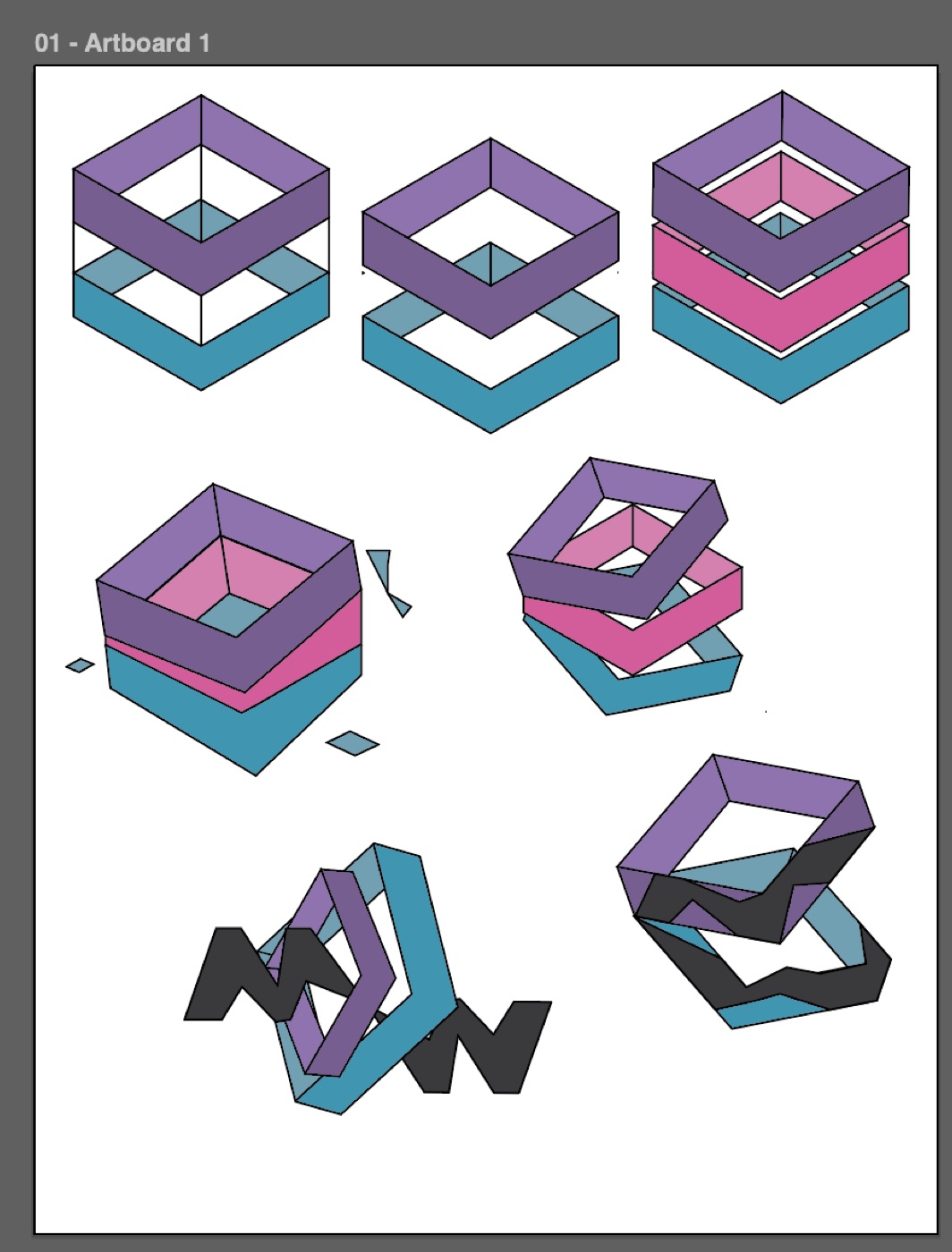
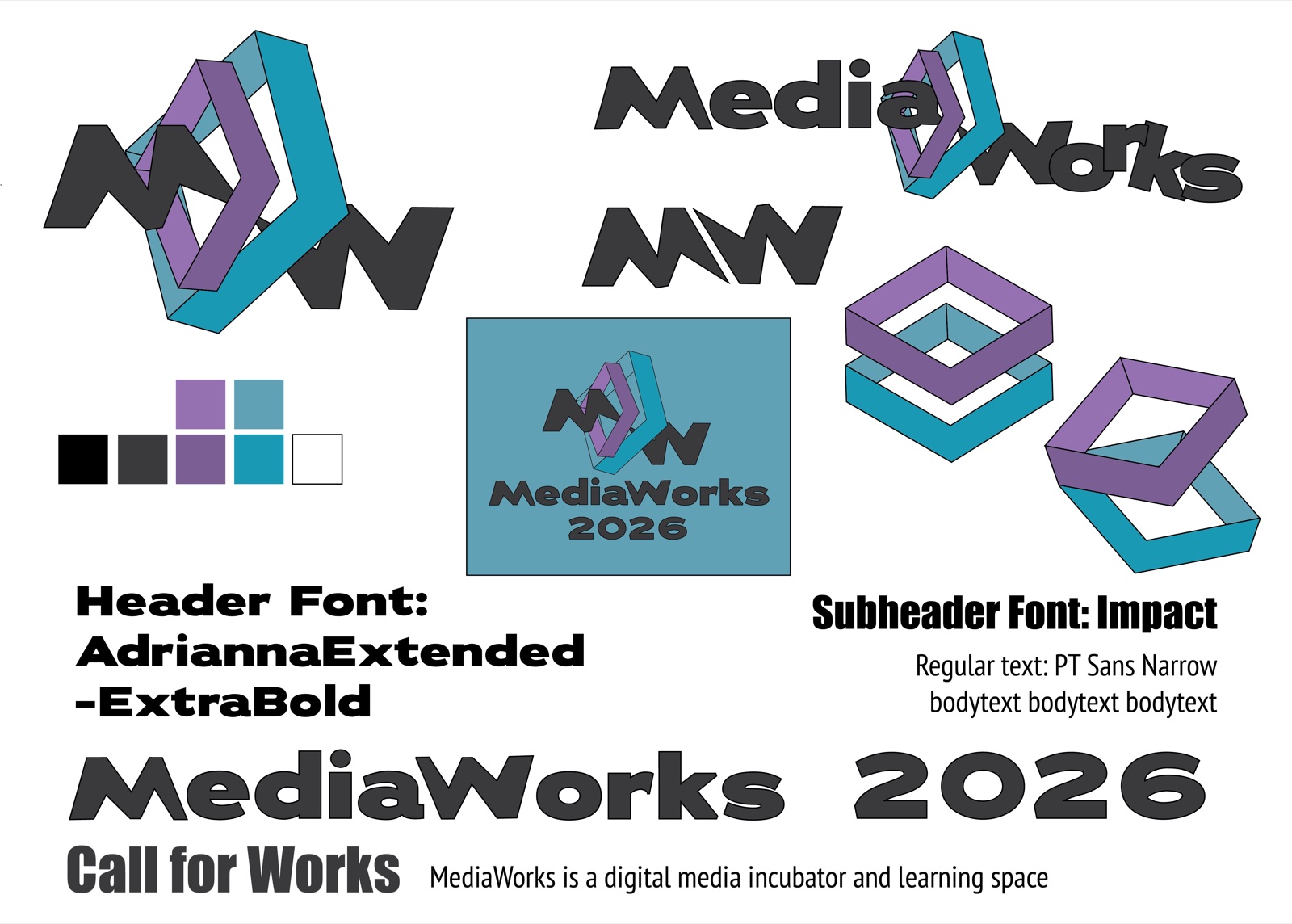
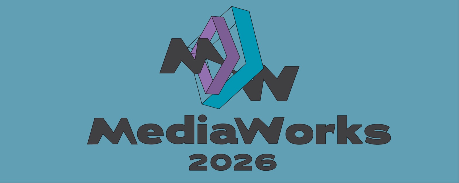
The MediaWorks initials — M and W — contain a mirrored relationship: flip one letter and it begins to resemble the other. I used two rectangular box forms to frame that transformation, a mark that reads as both an M and a W and reflects how media shifts, stretches, and reconnects as it moves through different formats.
The core identity used a blue-and-purple palette connected to imagination, creativity, and the dreamlike possibilities of digital media. Lighter variations were introduced when additional contrast or visual depth was needed.
The main display typeface, Adrianna Extended ExtraBold, gave the identity a bold and slightly stretched appearance. For the event title, the M and W were adjusted to visually connect the typography back to the mirrored logo.
Rather than creating one fixed composition, I developed a working visual reference that included the logo, typography, color palette, alternate wordmarks, and several ways of stacking or rearranging the two boxes — giving the team recognizable elements to work with without requiring every application to look identical.
03 — In Motion
Two boxes, rearranged
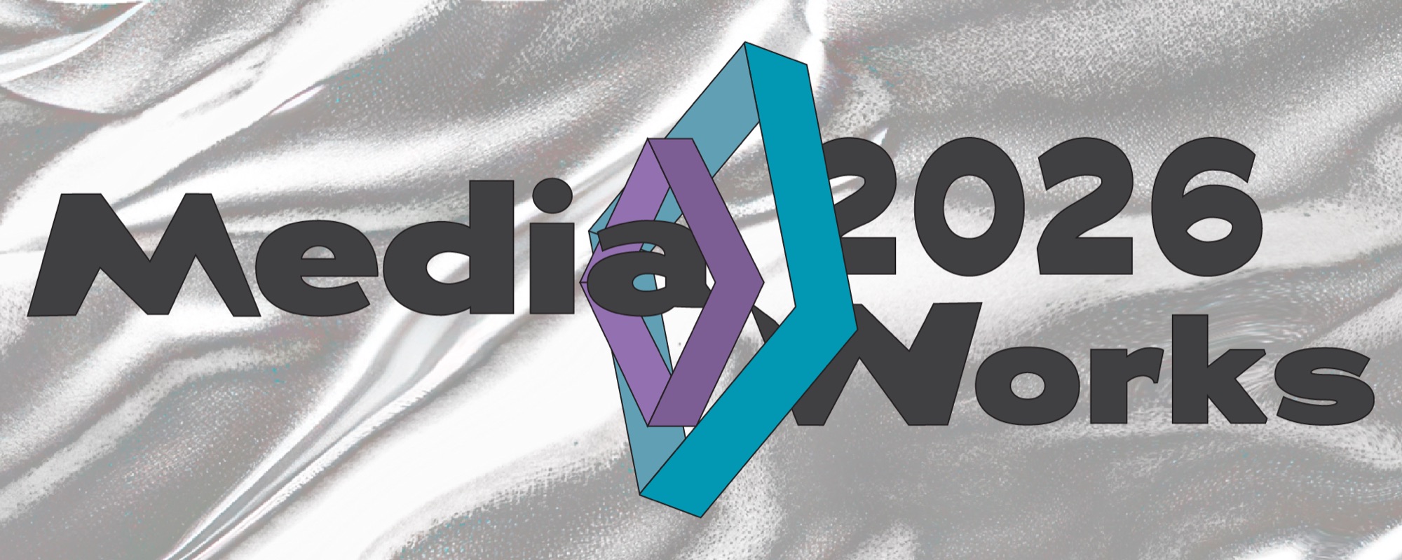
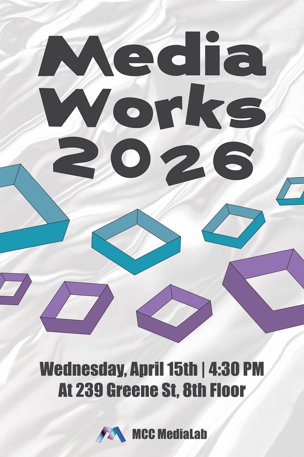
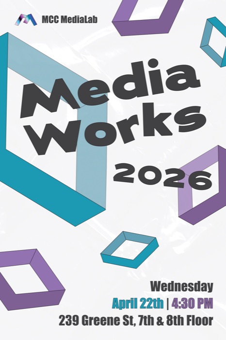
The pair of boxes became the most adaptable part of the system. Across different assets, I pulled them apart, combined them, shifted their scale, placed them behind text, and reorganized their relationship — allowing each format to respond to its own information and dimensions while remaining visibly connected to the larger identity.
The animated version extended this movement over time. The boxes slide into the composition before the full "MediaWorks 2026" wordmark appears, turning the static identity into a short sequence of arrival and transformation.
04 — Across Formats
Expanding across formats
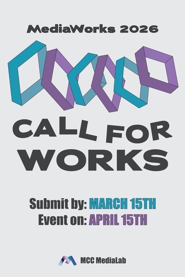
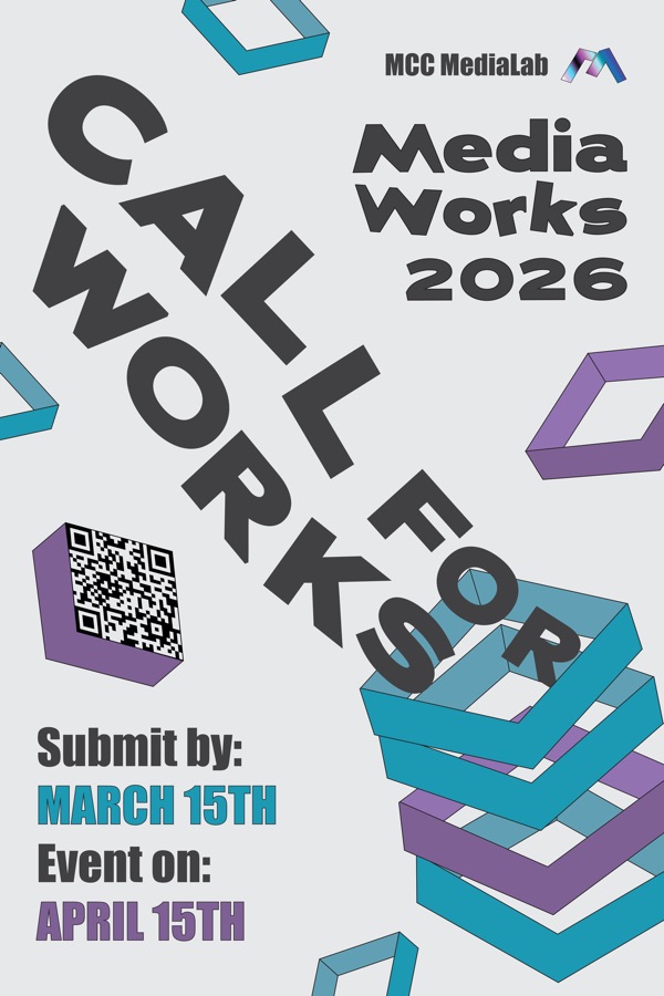
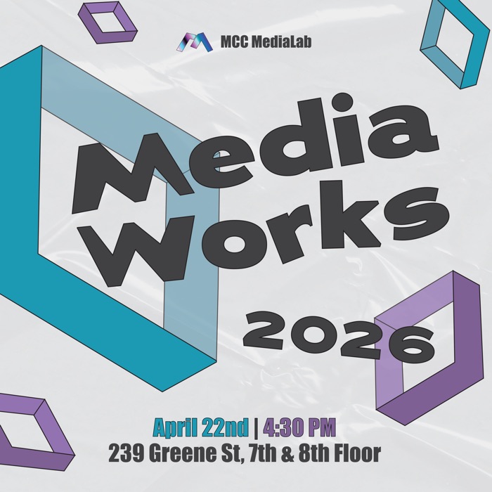
The identity was first developed as a logo, color palette, and typography system, but its role continued to expand as preparation for the event progressed. I created and contributed to the main event poster, call-for-works posters, Instagram and LinkedIn graphics, weekly newsletter banners, an animated promotional banner, the printed event program, 3D-printed keychains, project-card stands, hanging box decorations, and small MW logo ornaments.
Posters were distributed across campus in building displays, elevators, hallways, and other public spaces. Digital versions were adapted for social media and email, allowing the same identity to move between large-scale print and smaller screen-based formats.
Scroll to see more →
05 — Physical Objects
When the files became objects
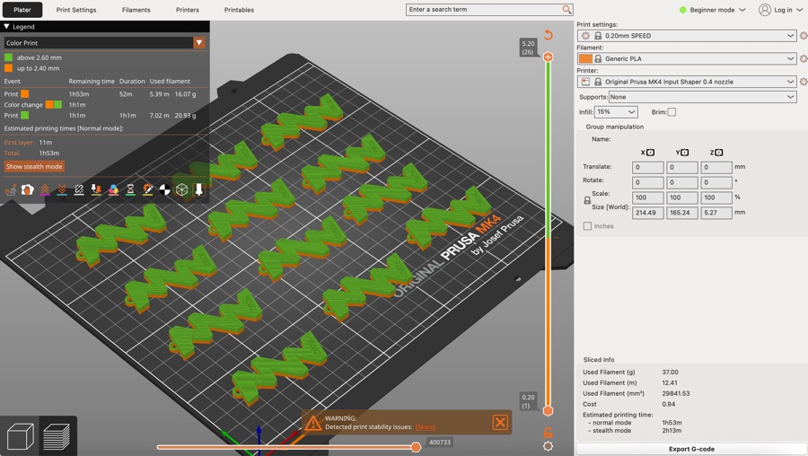
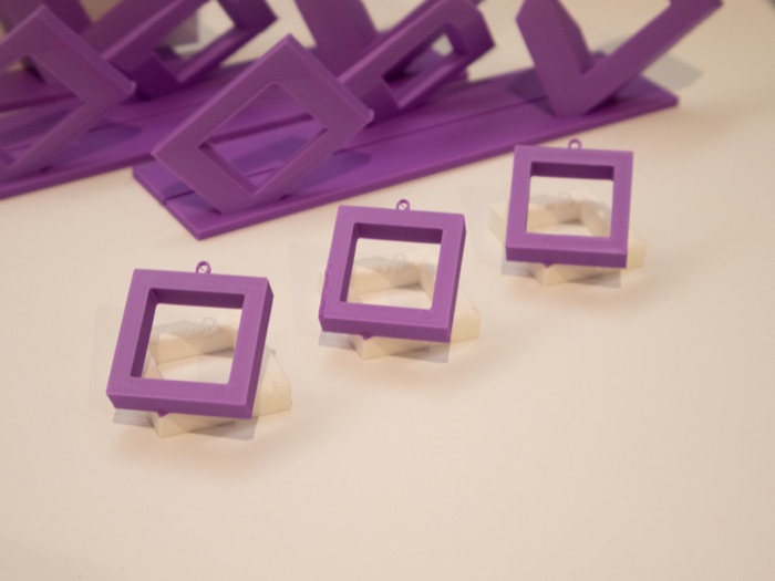
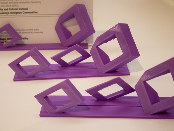
Some of the most extensive experimentation began when the identity moved from digital designs into physical objects. For the 3D-printed keychain, the model had to be tested several times before the dimensions translated successfully into print — the size of the opening and the thickness of the object both required adjustment.
The team also experimented with supports, layering, and color changes. Because the available printer could only change filament at a particular layer rather than assign colors to individual sections, the objects had to be designed around the limitations of the printing process — decisions that looked resolved on screen often needed to be reconsidered once the objects had weight, thickness, and material constraints.
Scroll to see more →
06 — The Program
Rethinking the event program
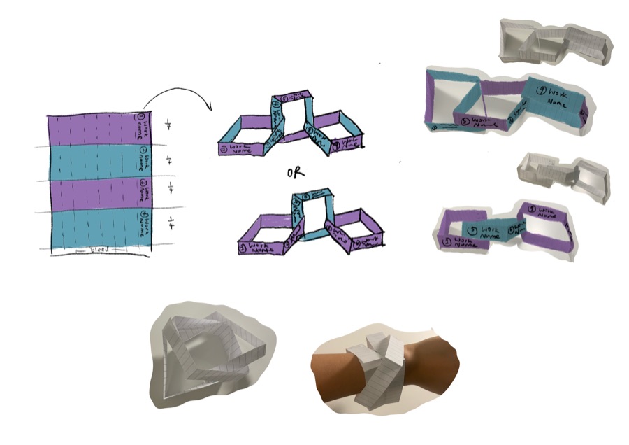
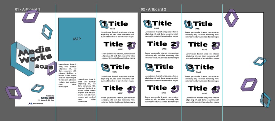
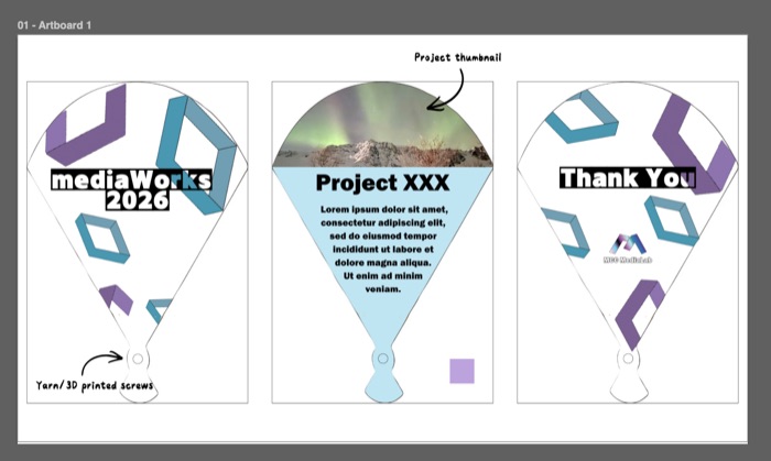
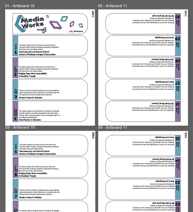
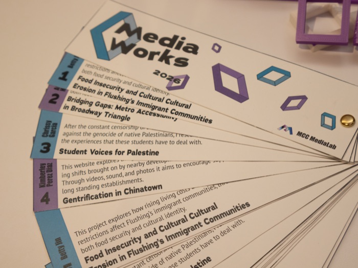
The program went through several structural directions before reaching its final form. An early version used a connected chain of boxes, directly referencing the identity. Another direction followed a more conventional pamphlet format. Through team discussion, these ideas were eventually combined with a proposal for a folding fan.
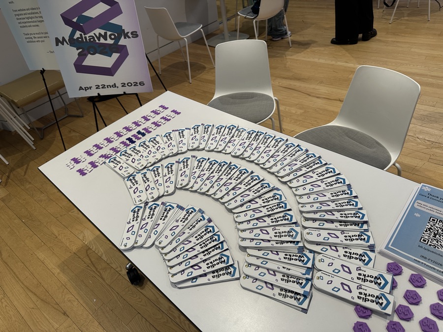
The fan format allowed each featured project to occupy its own leaf, with space for a project title, category, and short description. The format was portable, interactive, and more memorable than a standard pamphlet — its movement also reflected the identity, closing into a compact object, expanding into a larger form, and rearranging in the visitor's hands.
Producing the program required repeated print tests: adjusting the reversed order of the leaves, aligning front and back designs, refining spacing and color output, and experimenting with different finishing methods. The completed programs were distributed to visitors at check-in.
Scroll to see more →
07 — Event Day
One identity across the showcase
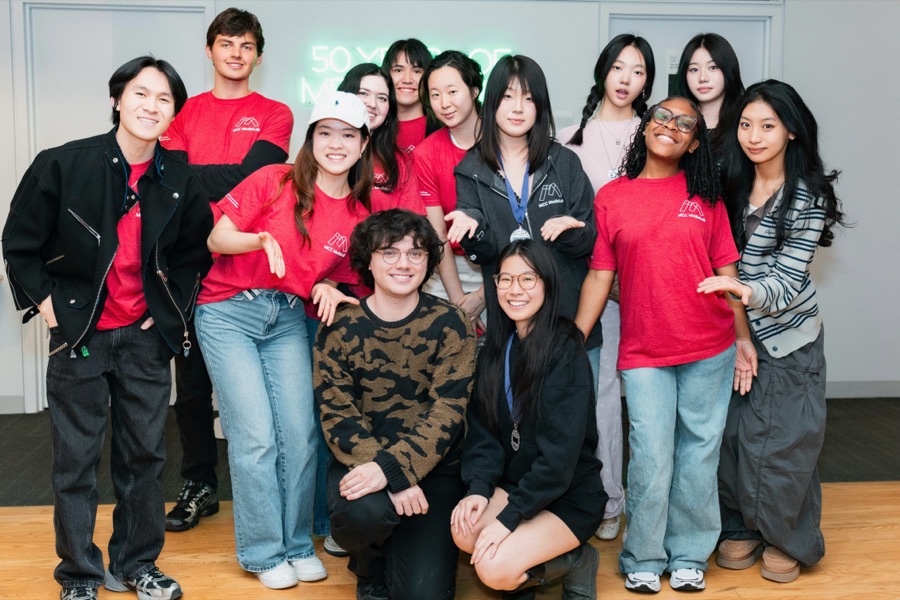
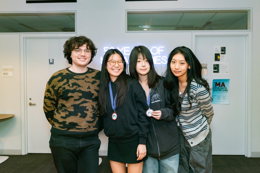
The strongest expression of the identity was not a single poster or object, but the event itself. On April 22, 2026, the system appeared across two floors through posters, programs, project cards, welcome boards, hanging decorations, 3D-printed objects, and informational displays. The individual pieces didn't all use the boxes in exactly the same way, but they shared enough visual language to make the showcase feel connected.
Scroll to see more →