
Case File 003 — Interaction Design / Museum Accessibility
Marked Across Time
An interactive museum experience that makes the seals on Autumn Colors on the Que and Hua Mountains more accessible through scanning, tracing, and contextual storytelling.
01 — Overview
About the project
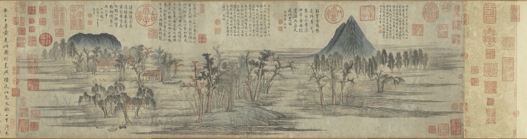
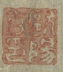
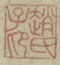
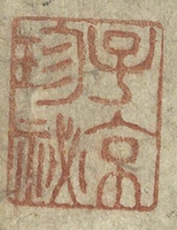
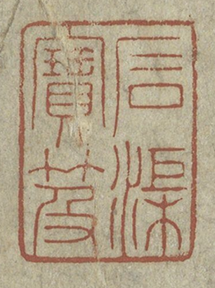
Autumn Colors on the Que and Hua Mountains is a thirteenth-century Chinese handscroll covered with seals added by artists, collectors, scholars, and emperors across several centuries.
Although these seals contain important information about authorship, ownership, and the movement of the painting, they can be difficult to understand without prior knowledge of Chinese seal script or collecting traditions. To many visitors, they may appear as small decorative red marks rather than meaningful parts of the artwork.
Marked Across Time is an interactive museum prototype that helps visitors slow down and engage with these overlooked details. Users can locate a seal on the scroll, trace its characters through a guided activity, and then learn about the person and history connected to it.
The project was developed through a collaboration between museum studies and computer science students. My role focused on designing and developing the tracing experience, information pages, and digital accessibility features.
02 — The Design Problem
Turning visual friction into interaction
The main design problem was not that the seals were hidden. They were visible throughout the scroll, but their meaning was inaccessible to many visitors.
Rather than beginning with a large amount of historical explanation, we wanted to create an experience that invited curiosity first. The interaction needed to help visitors notice the shape of a seal before asking them to understand its cultural and historical significance.
We designed the journey around three actions:
Find the seal. Trace its form. Explore its story.
This sequence allowed the project to introduce unfamiliar material gradually. Tracing acted as a bridge between looking and learning, giving visitors a reason to spend more time with a mark they might otherwise pass over.
03 — The Tracing Experience
Designing and refining the tracing experience
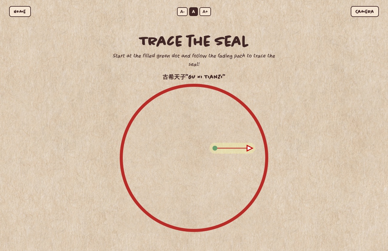
I developed the tracing activity in p5.js, breaking each seal character into individual strokes. For every stroke, the system stored:
- A starting point and endpoint
- A guided path and direction
- A range for acceptable user input
As users draw, the system checks whether they started in the right place, followed enough of the path, moved in the correct direction, and ended near the target. It works with both mouse and touch input.
One key design decision was how strict the validation should be. If it was too precise, the interaction felt like a test. If it was too forgiving, users could complete it without paying attention to the character. I adjusted the logic to prioritize guided learning over perfect accuracy.
After building the first version, I gave it to users to test. Feedback showed that many skipped the written instructions and began drawing immediately. Some started in the wrong place or did not understand why a stroke had not been accepted.
That shifted my focus from explaining the interaction through text to making the interface itself more intuitive. I refined the experience with:
- Clearer start and endpoint markers
- Stronger directional cues
- More immediate feedback
- Better distinction between completed and upcoming strokes
- A colored prompt that matched the tracing
The final version guides users as they draw instead of expecting them to understand the rules beforehand. This process also reinforced that usability and accessibility are closely connected: reducing reliance on written instructions makes the experience easier for a wider range of visitors.
Scroll to see more →
04 — Accessible Info Pages
Building accessible information pages
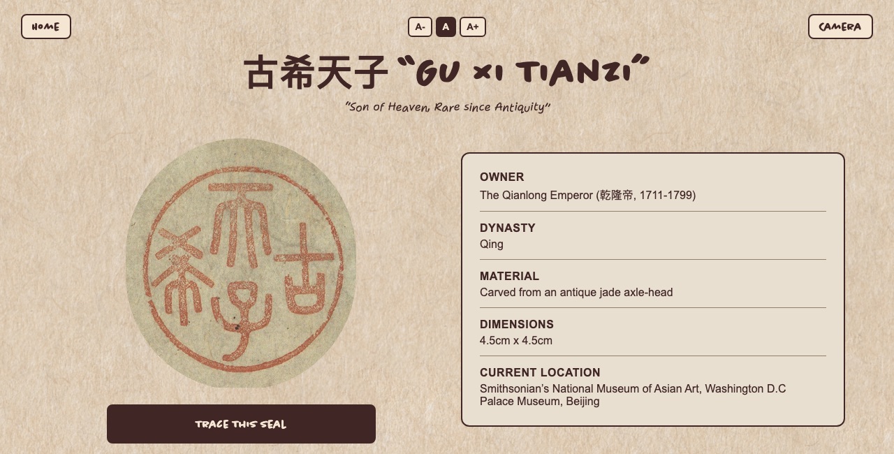
After tracing a seal, users can continue to an information page explaining who placed it on the scroll and what it represents.
I designed and developed these pages to support different reading preferences and levels of engagement. Each page begins with a concise information card, followed by a more detailed historical explanation.
The interface includes controls that allow users to:
- Increase or decrease the text size
- Listen to the written content
- Pause and resume the narration
- Return to the homepage
- Reopen the camera
- Repeat the tracing activity
These features were intended to support visitors with low vision, reading fatigue, language differences, or a preference for auditory learning.
The layered content structure was also an accessibility decision. Visitors could understand the basic meaning of a seal without reading the full page, while those interested in its broader historical and political context could continue further.
Rather than presenting the seal as an isolated translation, the page connects it to a human story. It explains who added the mark, why it mattered, and how it changed the way later viewers encountered the painting.
05 — Physical + Digital
Connecting physical and digital interaction
The larger team developed additional entry points that connected the physical scroll reproduction to the digital experience.
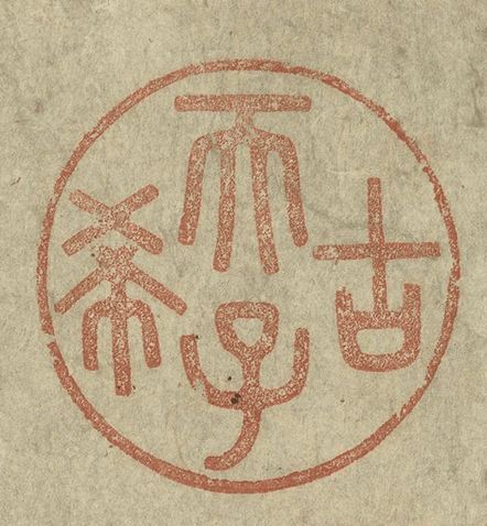
One team member explored tactile swell-form reproductions of the seals. Heat-activated printing raised the characters from the paper, allowing visitors to follow their forms with their fingertips.
Although this component was designed with blind and low-vision visitors in mind, it was intended for all visitors. Everyone would be encouraged to trace the raised characters, creating a shared tactile interaction rather than separating accessibility into a secondary version of the exhibit.
Another team member developed an 8th Wall scanning experience. Visitors could open a browser-based camera through a QR code and scan a seal on the physical scroll. Once the system recognized the image, it directed the user to the corresponding tracing activity.
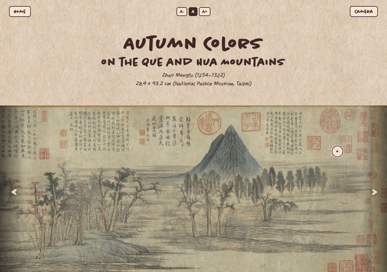
The homepage provided an alternative path. Visitors could move through a digital reproduction of the scroll from right to left and select hotspots placed over the featured seals.
Together, these elements created several possible ways to enter the experience:
- Scan a seal from the physical reproduction
- Explore seals through the digital scroll
- Trace a raised seal by touch
- Continue to the digital tracing activity
- Read or listen to its story
My work focused on what happened after a seal was selected: how users learned to trace it, moved through the interface, and accessed its meaning.
06 — Cross-Disciplinary Process
Designing across disciplines
Because the project combined museum studies and computer science, the design process required translating research into interaction.
The museum studies side of the team identified the historical importance of the scroll and selected seals that represented different relationships to authorship, ownership, collecting, and imperial power. The development side transformed that material into an experience visitors could navigate.
My role required working between the two. The tracing interaction could not be designed separately from the structure of the characters, and the information pages could not simply reproduce academic research without considering how a museum visitor might approach it.
This collaboration shaped the final experience. Historical content informed the sequence of the interaction, while usability and technical constraints influenced how much information could be introduced at each stage.
The project also showed how small interface decisions can shape cultural interpretation. The order of a stroke, the timing of feedback, and the placement of a button all affect whether a visitor feels invited into the material or excluded from it.
07 — Reflection
Reflecting on accessibility and what comes next
The strongest part of Marked Across Time was the relationship between interaction and interpretation.
Tracing was not included only to make the exhibit feel playful. It became a way of slowing visitors down, making an unfamiliar visual language feel less intimidating, and encouraging closer attention to details they might otherwise overlook.
The project also changed how I thought about instructions. A feature can function correctly and still be difficult to use. Early critique showed that users often skipped written directions and began interacting immediately, which meant the interface needed to communicate more through motion, hierarchy, and visual feedback.
At the same time, the prototype did not remove every barrier. The digital tracing experience remained strongly visual. Blind visitors could engage with the tactile seals and audio content, but the tracing activity itself would need additional nonvisual guidance to offer a more equivalent experience.
Future iterations could include:
- Animated stroke demonstrations and clearer directional cues
- Audio guidance throughout the tracing process
- Full keyboard and screen-reader navigation
- Multilingual narration and interface text
- Shorter, more visual onboarding
- User testing with blind and low-vision participants
- A nonvisual alternative to the canvas-based tracing activity
These improvements would extend the project's central goal: not simply adding accessibility features, but creating more ways for visitors to understand and participate.
By combining guided tracing, adjustable information pages, audio support, tactile exploration, and image-based scanning, Marked Across Time creates several paths into the same object. The seals remain small marks on an old scroll, but the experience helps visitors recognize them as evidence of people, movement, and meaning accumulated across time.