
Case File 002 — Web Design & UI/UX
FAIR & IOS
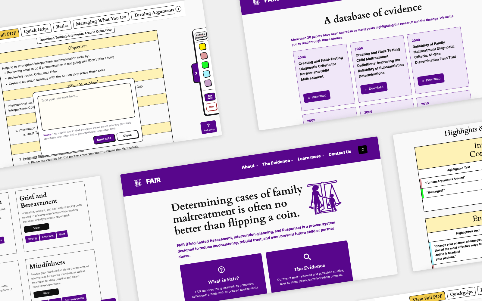
Two websites developed for NYU's Family Translational Research Group, making an evidence-based assessment system and intervention toolkits easier to explore and use online.
01 — Overview
Two websites, different needs
FAIR and the IOS Toolkit were developed by the same research group but serve different purposes.
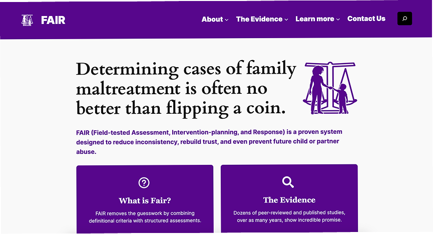
FAIR — Field-tested Assessment, Intervention-planning, and Response — is a proven system designed to reduce inconsistency in child and partner abuse assessments, rebuild trust, and support prevention. Its website needed to introduce the system, communicate its evidence, and help potential partners understand its relevance to their work.
The Integrated Operational Support (IOS) Toolkit provides evidence-based guidance, psychoeducation, and session exercises for mental health technicians. Developed in partnership with Department of the Air Force behavioral health technicians, the materials had been circulating through a large Dropbox collection of PDFs that were difficult to find and offered no interactivity.
Our task was to turn those resources into an online system that could be accessed across devices, with navigation, highlighting, annotations, and ways to revisit useful material. My work spanned architecture, wireframes, visual design, and front-end implementation.
02 — Structure & User Paths
Organizing before styling
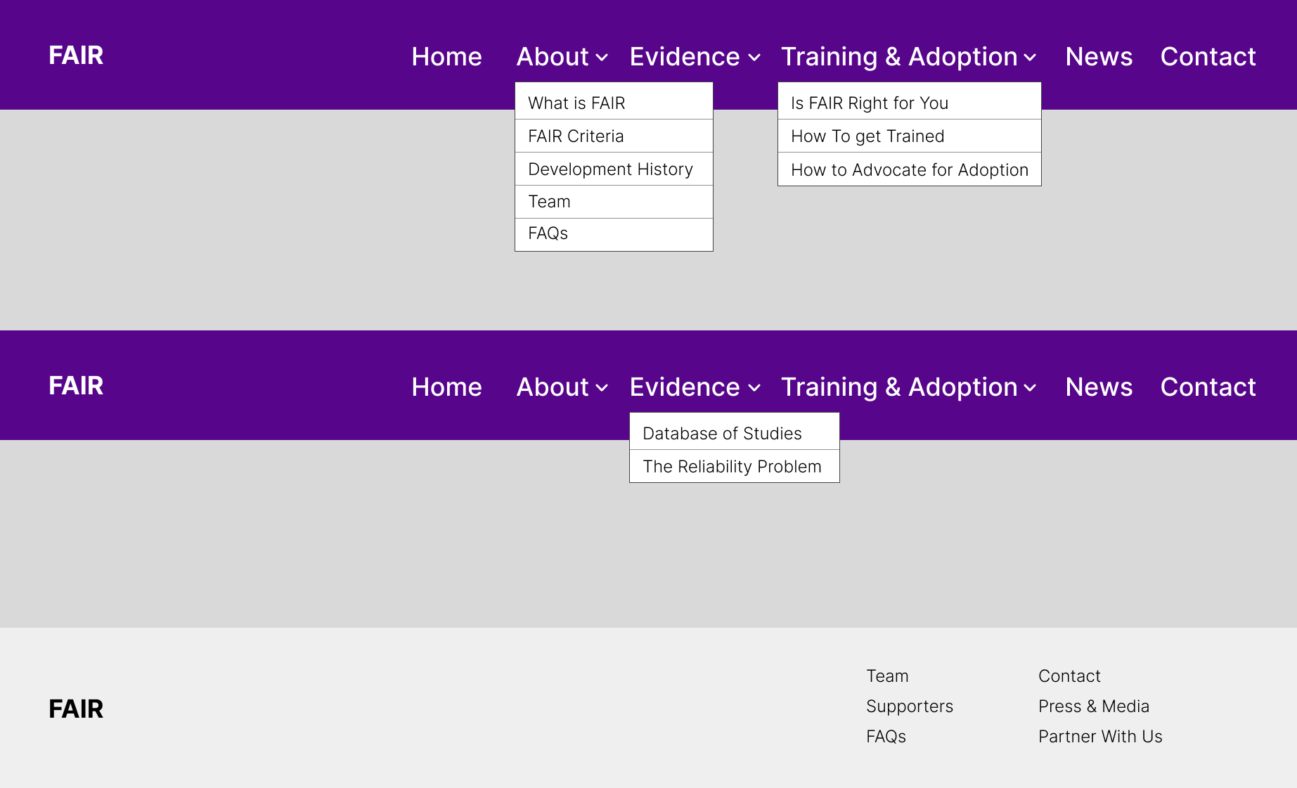
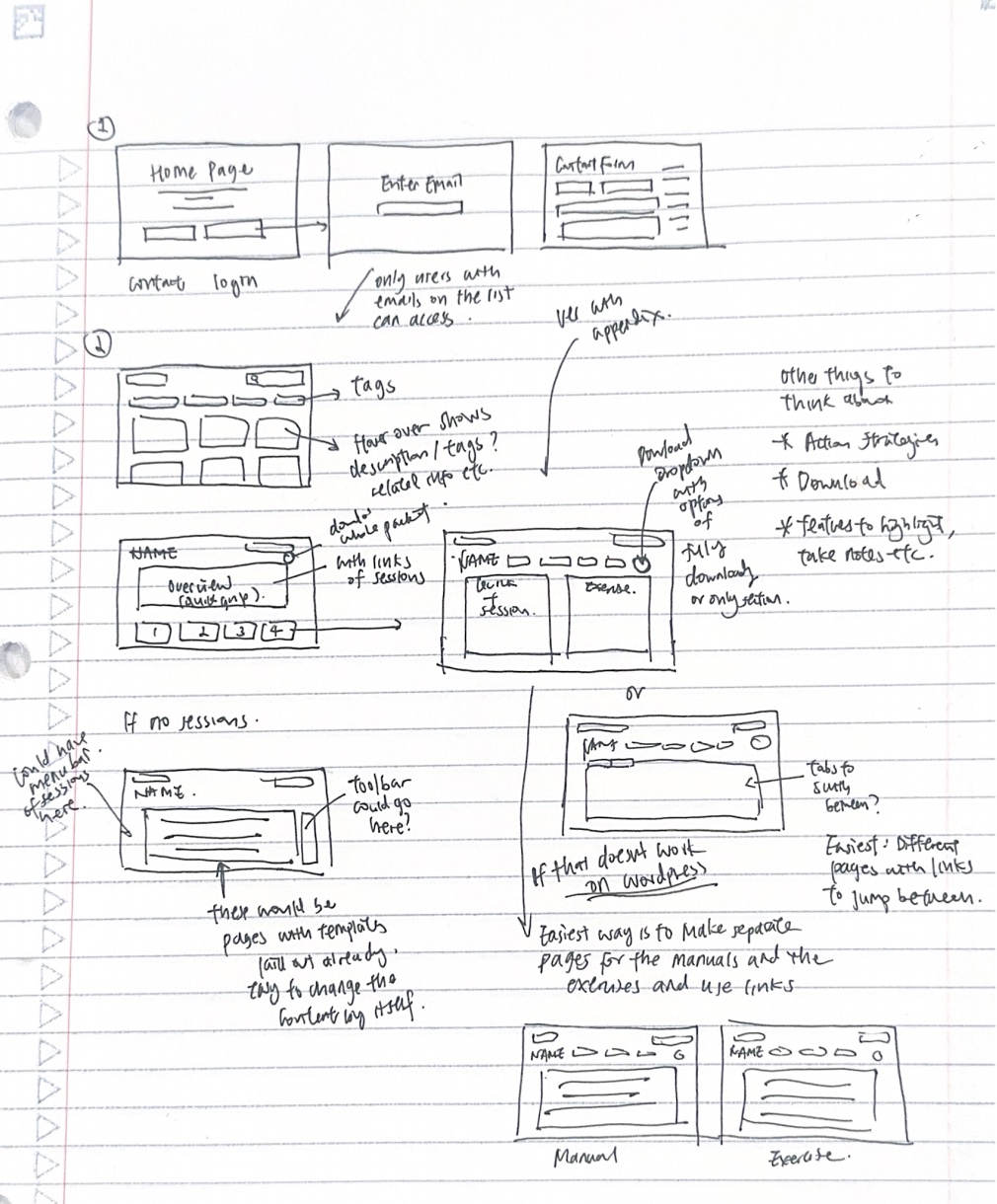
I worked through the site architecture and wireframes before developing the final layouts, considering what belonged on each page and how visitors would move through the content.
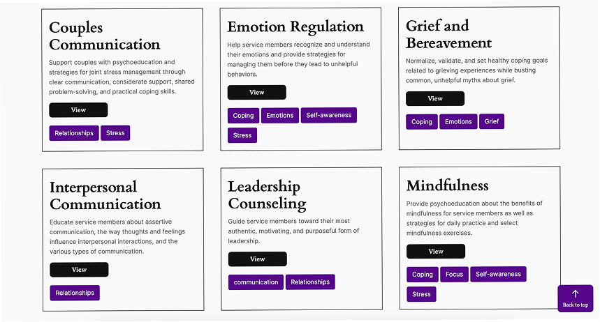
For FAIR, the path led from an introduction to the system toward evidence, suitability, and contact. For IOS, it led from selecting a topic to navigating a toolkit and finding a particular module or exercise.
The IOS manuals already contained titled sessions and modules. I preserved that structure while adding more direct routes through the material, allowing readers to follow a toolkit in sequence or jump to a specific section.
Quick Grips required a similar balance. We organized these shorter resources at the beginning of a toolkit, linked them to their corresponding sections, and retained their original placements within the content. This supported both quick reference and reading in context.
Scroll to see more →
03 — Visual Direction
A consistent hierarchy across both sites
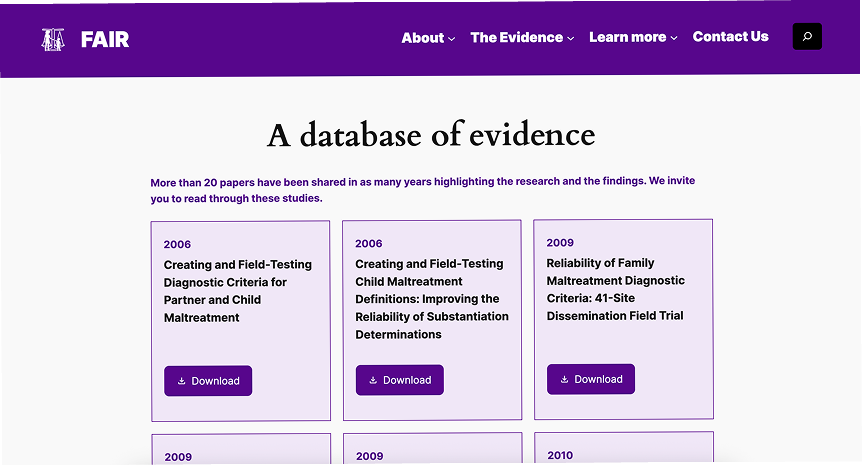
I developed a shared visual direction around the requested NYU purple, introducing light and dark yellow accents, supporting neutral tones, and blue within selected toolkits. I selected a WordPress font pairing of Cardo for headings and Inter for body text.
The layouts needed to distinguish introductory copy, research explanations, toolkit instructions, and exercises. I used heading levels, spacing, color, and repeated section patterns to give dense content a clearer hierarchy.
For FAIR, the content team supplied copy and initial direction for elements such as evidence bands, testimonials, boxes, and buttons. I determined the final styling and refined compositions and icons through iterations.
For IOS, I handled the UI from early wireframes through the final toolkit pages and supporting screens, extending the visual language to navigation, forms, the annotation toolbar, and My Library.
#57068C
#F0E7F7
#F1CA4B
#FFF2B7
#F9F9F9
#000000
Headings · Cardo
A database of evidence
Body · Inter
Provide psychoeducation about the benefits of mindfulness for service members.
04 — FAIR
Introducing the system and the next step
FAIR's website needed to make a complex research-based approach understandable to people considering it for their organization. I worked with the content team to organize that information into manageable sections, giving the homepage an introductory role and allowing supporting pages to carry more detail.
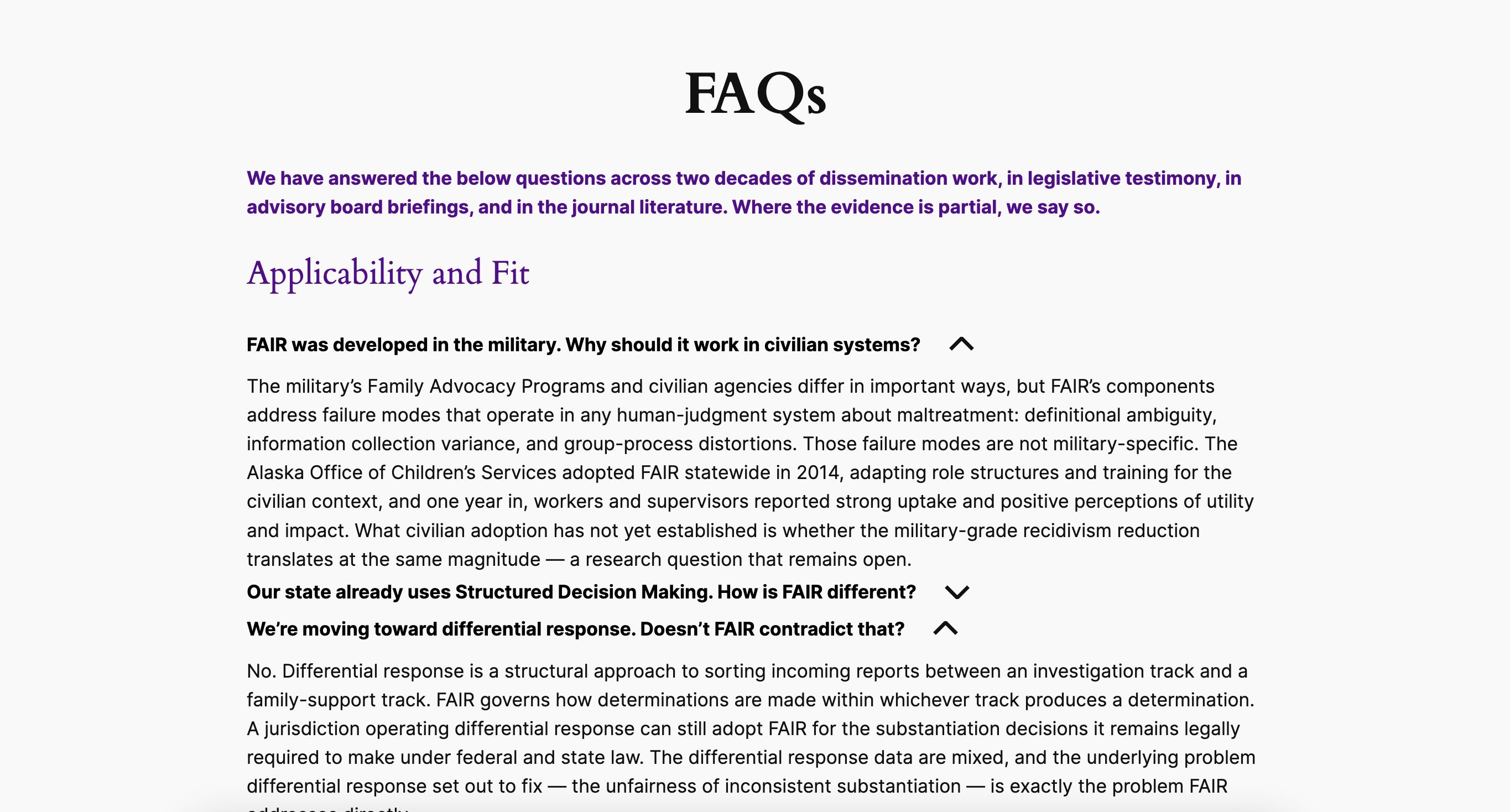
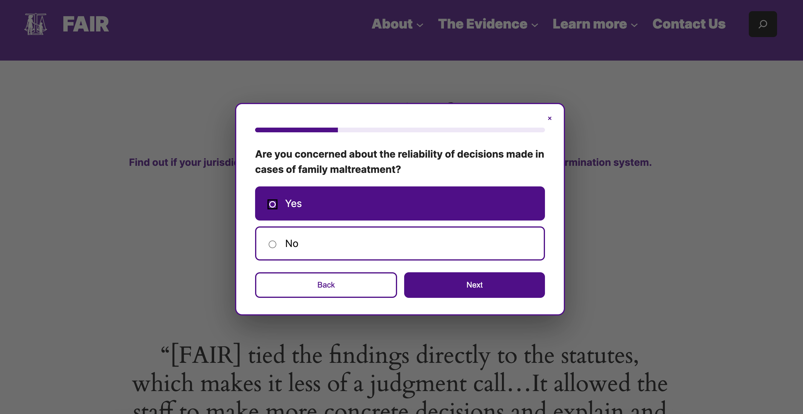
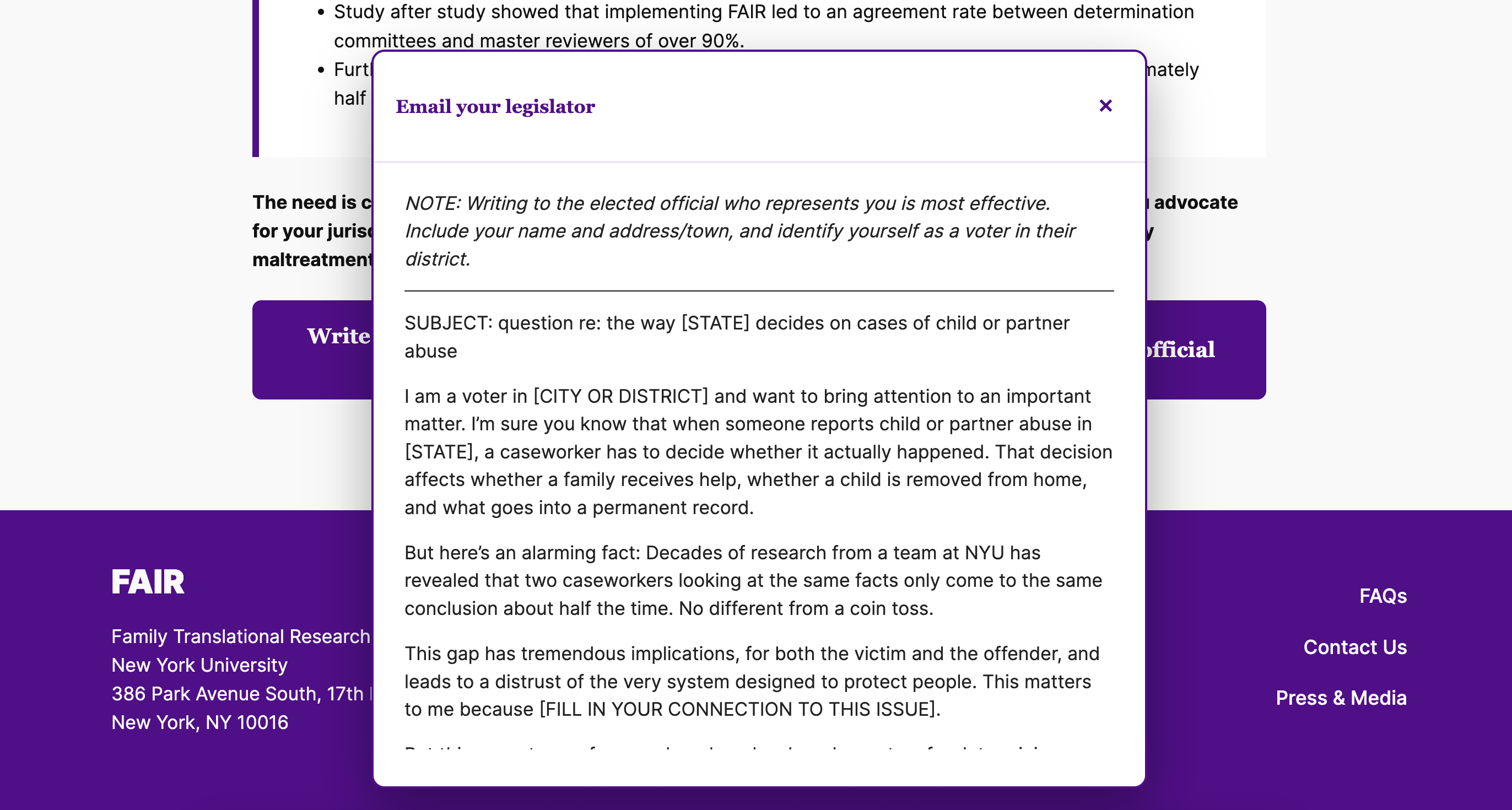
Expandable team profiles and FAQs keep additional information available without presenting everything at once. A short "Is FAIR right for you?" quiz provides a more focused entry point, helping visitors consider the system in relation to their own work.
Pop-up letter and email templates offer practical support for outreach. Together, these features connect the website's explanation of FAIR to actions visitors can take afterward.
Scroll to see more →
05 — IOS Toolkit
Reading, saving, and returning
The IOS website turns long-form PDFs into a navigable reading experience. I designed the toolkit layouts, built the sticky in-toolkit navigation, and integrated bookmark controls into the toolkit and library interfaces.
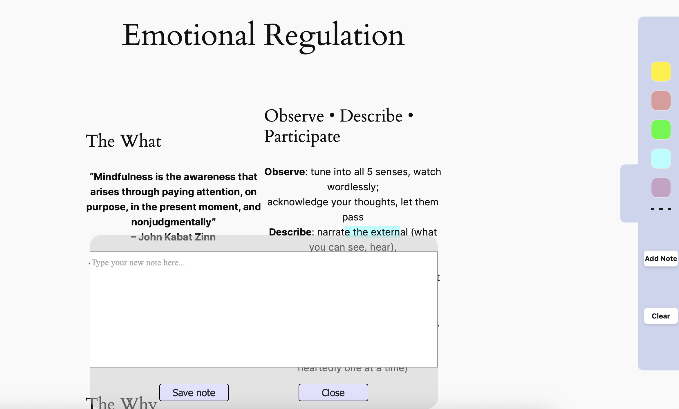
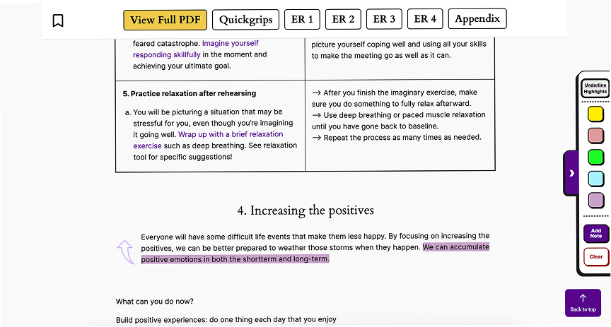
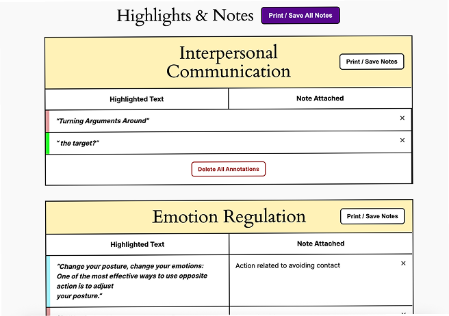
I also helped shape how highlights, notes, and annotations appear alongside the content and how saved material is presented in My Library. Bookmarking identifies a whole resource, while highlights and notes mark specific passages; the library brings those selections into one place.
Two developers on the team built the core feature logic, including the annotation toolbar and storage behavior. I contributed interface ideas and front-end code, styled their initial prototypes, and helped refine the features through discussion. My work also covered login styling, navigation visibility, buttons, and print/download controls.
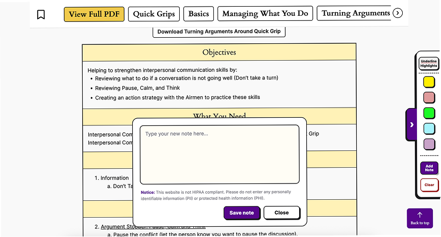
The final system includes bookmarking, highlighting, adding and deleting notes, My Library, login, WordPress search, and print/download options for notes and toolkit sections. The website supports access across devices, while saved annotations use browser storage rather than automatic cross-device syncing.
Scroll to see more →
06 — Feedback & Accessibility
Refining how the tools behave
We met regularly with our point of contact on the toolkit team, who gathered staff feedback and brought questions back to the wider group. These discussions shaped several changes to the reading experience.
The toolkits initially presented static content. Staff requested fillable text areas for exercises, prompting us to consider both the input fields and how to explain their limitations. We added notices to make clear when typed responses would not be saved.
Other requests focused on returning to saved material: deleting notes directly from My Library and jumping from a saved note to its exact position in the toolkit. These changes helped connect the library to the original reading context.
Faculty feedback supported our accessibility and technical review. I addressed color contrast, image alt text, form labels, aria-labels, button labels, and heading structure, using axe DevTools and WAVE to identify issues and check revisions.
07 — Handoff & Reflection
Building for continued use
I implemented the designs within NYU's WordPress environment, combining the block editor with HTML, CSS, and JavaScript. This required balancing custom layouts and interactions with a website the team could continue editing.
I prepared guidance for page updates, navigation, links, and custom code areas, helping distinguish routine content edits from changes that could affect site behavior.
Both websites launched following the May–August development period, with domain-name arrangements still being finalized. FAIR provides a public introduction to the assessment system, while IOS brings previously dispersed toolkit PDFs into an interactive web resource.
The project showed me how much a digital experience depends on the routes around its content: how someone enters, finds a section, marks something useful, and returns to it later. It also gave me experience carrying interface decisions from wireframes into a live WordPress build while collaborating with content specialists and developers.